| Stoichedon Lettering |
|---|
The term "stoichedon" refers to an arrangement of the lettering of an inscribed document in which the letters are cut in a grid pattern with the letters of each line vertically aligned with those of the preceding and following lines. The visual effect produced by this arrangement varies according to the tightness of the grid. Contrasting examples are illustrated below, from IG, I3, 65, in which the letters are closely spaced, and IG, I3, 54, in which the looser spacing of the lettering emphasises the effect of the grid. |
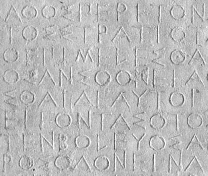
Lines 10-17 of IG, I3, 65 |
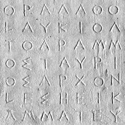
Lines 4-10 of IG, I3, 54 |
|
The stoichedon style is best attested in the epigraphy of Athens in which it predominates for much of the fifth and fourth-century in public documents. Inscriptions cut in stoichedon style are also well attested outside Athens - for example, at Delphi or on Chios or Samos. There is a monograph discussion of stoichedon lettering by R.P. Austin, The Stoichedon Style in Greek Inscriptions (Oxford 1938); cf. also the discussion by M.J. Osborne, ZPE 10, 1973, 249-70.
|
Home | Events | Newsletter | Links | Search |
|
Comments from users are invited and should be addressed to
Last updated on |